
The Human The Body
website concept
- Case Study -
The Human. The Body - The Back Story
All our projects are one of a kind, yet somehow, The Human. The Body took us to a completely different playground. One of those projects that taught us how to combine science with fun, it is with great pleasure that we always remember the work we put into it.
This “science project” required a distinct separation between the human mind and consciousness, on one hand, respectively the human body, on the other hand. Our challenge was to separate the two of them and present them in different and unique ways. Through articles and topics, classifying them by individual categories, we went on a journey that allowed us to discover the human body and spirit in all its greatness – while doing the coolest web design and development tweaks.
VISIT LIVE WEBSITEOUR ROLES
- Art Direction & Design
- User Experience
- Concept Development
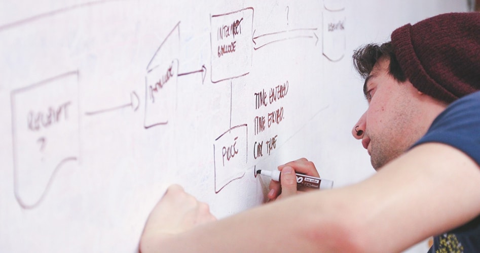
The Planning
/ Phase 1 /
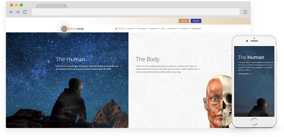
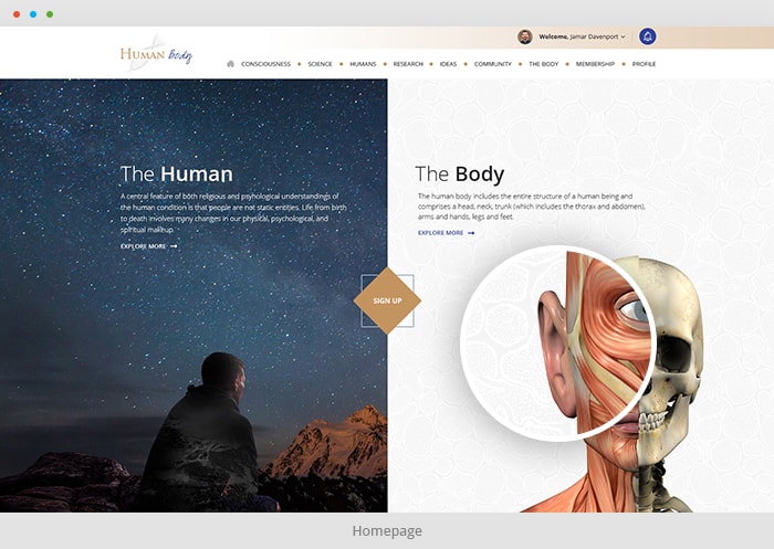
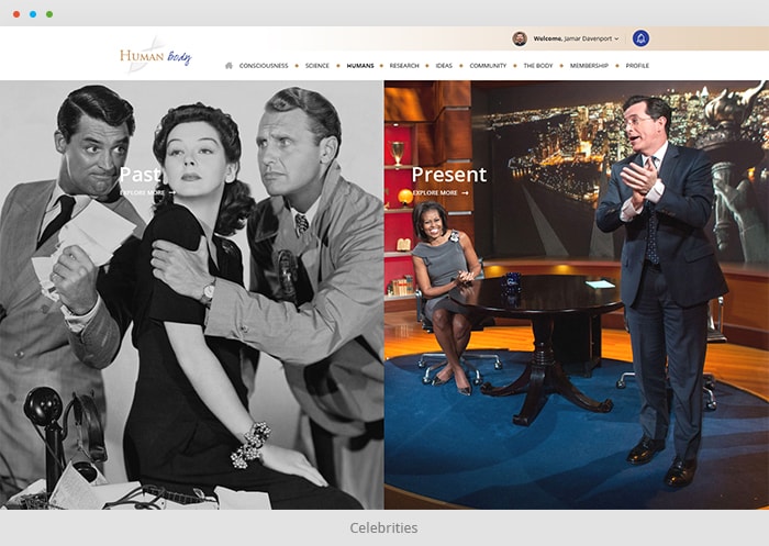
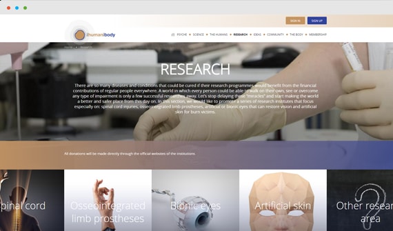
Our client was on a challenging quest, looking to inform, educate, and entertain two divergent categories of target audience: the people who care about their souls and those who care about their bodies. One of the first things we did was to plan the main topics that would interest both audiences. That’s how we came with the 7 main categories of the website: “Psyche”, “Science”, “The Humans”, “Research”, “Ideas”, “Community” and “The Body”, plus a special “Membership” section for those willing to take the extra step and dig deeper into this fascinating community.
The User Experience
/ Phase 2 /
We aimed for a simple but consistent user experience, based on an elementary, beautiful user interface. The eye-catching imagery across the whole website wasn’t meant to shift focus from the interesting articles, each one carrying its own role: imagery had to create emotion and feed the soul, whereas texts had to feed the conscious mind with factual information. At the same time, navigation between categories had to be super-simple, allowing users seamless access through all the corners of this online universe.
1
The Nuts&Bolts Of Research
In order to make this website a go-to resource for all the right audiences, we had to have the most accurate image of those audiences. So we did our meticulous research, like we always do for any of our clients, and came to the conclusion that there were two main user types: the ones engaged in a spiritual journey, searching for information about the human self, mind, and consciousness, and the ones interested in the practical side of things, like science or biology.
2
Resuscitating The Tedious
Most websites rely on design patterns and plain texts, making you feel like a machine sitting in front of another machine. We wanted this website and all the information it encompasses to make readers feel. The major challenge was to come up with a design that is both modern and simple at the same time, as we didn’t want to take away the main focus from the articles.
3
Savvy Information Architecture
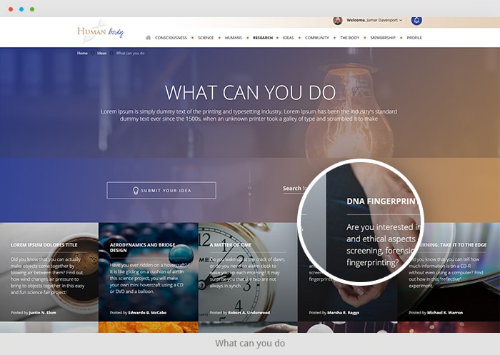
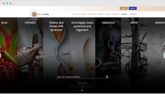
It only takes one glance to realize that the website hosts an overwhelming collection of content, covering a large scale of topics regarding the human psyche, consciousness, the human body, and science. One of the first things we did was to categorize this content and to create separate sections for each of the described topics, breaking them into those 7 menus previously mentioned.
4
The Simplicity Of Complicated Info
With long texts and information that makes you think and process, we had to somehow lighten the reading. Just to make everything more readable and easy on the eye, we edited the long, complex articles with the “Open Sans” font from the Google Fonts gallery. Headings and content suddenly became cleaner, making for an enjoyable reading.
The User Interface
/ Phase 3 /
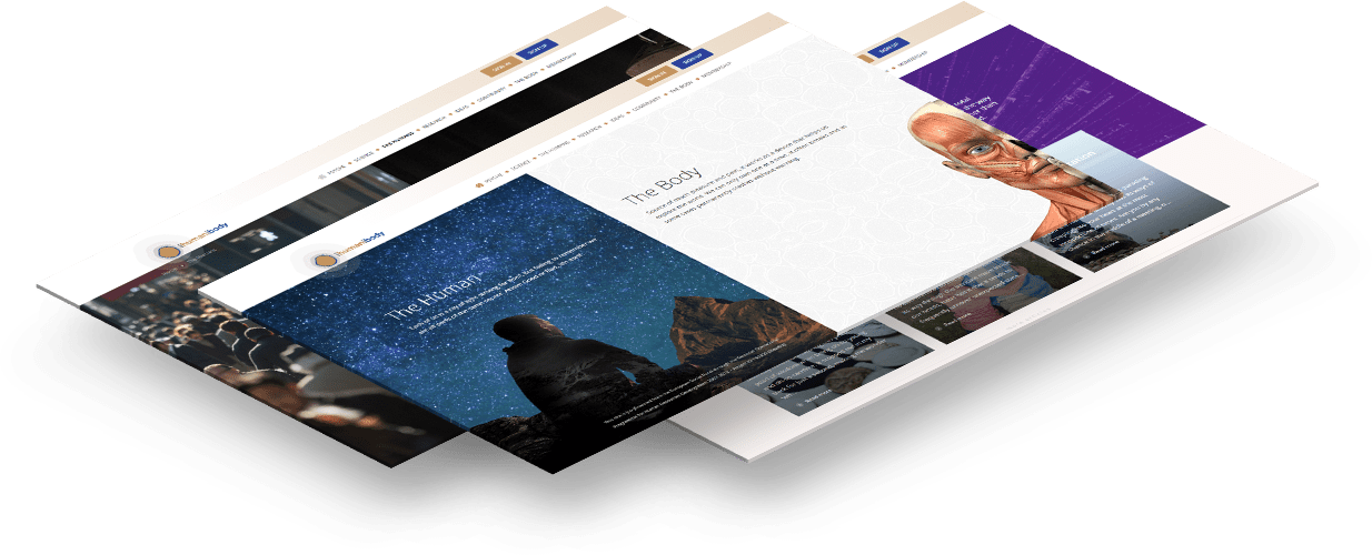
In line with the airy, light font of the texts we crafted an overall minimalist design. The flat style, based on big bold headings and a light color palette served as frame for the entire content. The user interface became both catchy and simple for the eyes, adding more focus to the content itself through clear, modern fonts, and that beautiful, oversized imagery.
Explore this slide on the right side for a better view of what visitors experience on The Human. The Body website.
CHECK OUT THE REAL PIXELS
Custom Development
/ Phase 4 /
Whether it was for the spiritual or the analytical readers, we wanted their interaction with the website to be a fascinating journey. To inform and to guide throughout this journey, we laid down all our objectives, we implemented micro-interactions, we integrated a forum, and we even made PayPal an option inside the platform. Read more on these custom features below:
The Human Body - scientific project with access to a huge collection of articles about science, biology, the human body and mind
Vision, Mission, Goals
Sure, we wanted to inform, but our client’s first and main objective was to create a large community of curious and passionate people who sustain his cause. Our goal was, therefore, to encourage visitors make a donation in exchange for the access to a huge collection of articles about science, biology, the human body and mind.
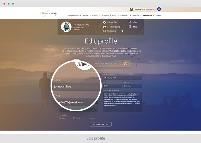
With our main audiences in mind, we started to analyze and plan the most appropriate contexts inside the platform where we could direct a visitor to sign up and donate. We also had to identify the technical aspects we would have to cover in order to make registration, navigation, and user experience harmonious, once the visitor decided to subscribe.
Paypal integration
PayPal is one of the most popular and secure online payment options. To make visitors more confident in donating for the use of the platform, we decided to integrate it with our client’s website.
Aside from the background work with the PayPal integration, we also focused on designing a special box that would inform readers they can pay without even having a PayPal account – like we said, everything to make the process smooth and trustworthy.
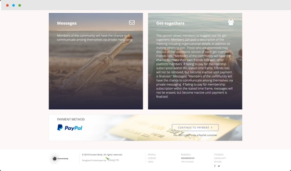
WordPress scientific project personalized with the most popular and secure online payment system - PayPal
WordPress scientific project personalized with the most appreciated features: short introductions, search options, etc
A Customer’s Journey
Micro-interactions played a major role in structuring the website. Some of the most appreciated features are: the long pages that start with a short introduction on what will the user explore; the pop-up text boxes that tell users where they need to sign up or sign in for accessing a particular section; or the search options available in different parts of the website.
Furthermore, every page is accompanied, right under the website logo, by a short, linkable address of where the user is and what path it followed to get there. Also, pages that offer two main options present them in the mirror, making choices crystal-clear, while drag-to-navigate graphical symbols are implemented wherever necessary.
Forum integration
We planned and developed the website as both an educational and a practical resource. The Community section was, therefore, particularly enhanced with a wide range of direct interactions.
The forum is the central part of the Community, as it allows users to address questions that consume them most. The development work we did for its integration, from profile creation to assigning user roles, was performed with focus on adding more usability to the entire website.

WordPress scientific project personalized with a forum for the Community section, which facilitates the interaction with the readers
The Human Body - scientific project with a massive community where the people can find more about the human nature
Wrapping It Up
In the end, we built a massive community where people can do unimaginable things. With The Human. The Body visitors are constantly amazed, from how it looks to what it reveals, from how they are guided, to what they can achieve.
The first interaction usually makes them anticipate a generous resource of articles, but the community hidden inside, the research center, the ideas laboratory, and all the other on-site features are an endless source of fascination.
You are delighted with our The Human, The Body project?
Would you like to own one project like this? Let’s discuss your project,
and discover our offer ...
clients we work with