The Use of Minimalistic Design in Present Day
The famous designer Saul Bass used to say that “Design is thinking made visual”.
Do you want to make your users over think?
We hope you don’t, which is why we advise you to always go for the simplest and cleanest web design. Go for minimalistic design.
What does minimalism have to do with designing a website?
How can it help your users have a happier and more productive experience on your website?
Read on and discover the power of balancing aesthetics with functionality in a flawless web design where less is usually… more.
Minimalism in a nutshell
Minimalism can be described as the technique or style that narrows down general information or complex elements to its simplest form. By eliminating all the unnecessary details that otherwise would have taken the focus from the core functioning of the product, it all comes down to extreme simplicity.
Design more with less
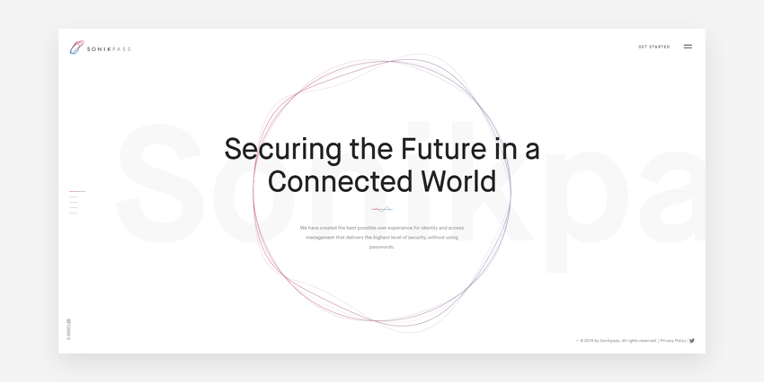
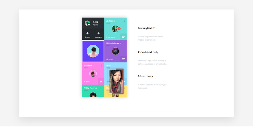
Using minimalism and big white spaces sets the trend nowadays, with more and more new websites embracing the minimalistic design. Even though the proper use of this design style seems simple, practice brings more difficulties than theory.
The main challenge derives from the need of adjusting the text information to the new design. Wherever the design relies on only a few objects or elements, with big open white spaces and a lot of text information, text editing is crucial.
The key here is to narrow down the text information to its simplest and most basic form, while displaying the most relevant part of it. Same applies to the design elements.
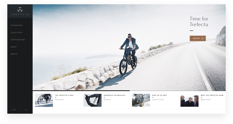
https://www.trefectamobility.com/
Minimalism as a discipline
We see minimalism applied across a wide range of fields aside from web design and graphic design. For instance, we can encounter this design style in different forms of art, fashion, music, home decorations, interior design, and even electronic devices. And everywhere it shows up, there is this key factor: minimalism aims for simplicity.
In most cases, designers work with content in mind. Content is the important part here, defining how all the design elements revolve around it. Therefore, if you want to have a minimal design style on your website you can’t have a complex, complicated message. The message should be simple and straightforward.
Whenever designing for a particular piece of content, designers should ask themselves 3 simple bold questions about that content:
- Is it easy to understand for the end-user?
- Are messages easy to comprehend, without too much side explanations?
- Does it help the user to find the desired information easier?
Only when the answer to all of the above questions is yes the designer has a solid base to start redesigning in a minimalistic style
The use of Whitespace or Negative space
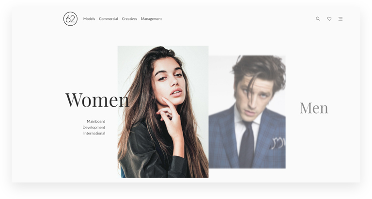
Whitespace comes in action wherever there are few images, texts, and design elements, complementing all these in the most natural way.
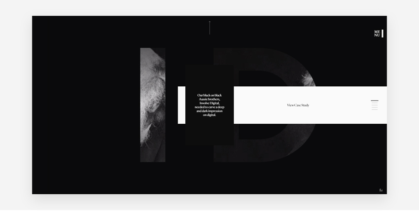
In most cases, whitespace serves as background – it helps to separate the main elements and sets contrasts with dark fonts or dark design elements. Nevertheless, there is no specific rule for this – one can choose the other way around, setting a light font on a dark background. It all comes down to a contrast.
Best practices in Minimal Design
So far, we have narrowed down the minimalistic design to only 2 specific attributes: extreme simplicity and contrasts. Still, there is more to it than meets the eye:
1. Attention grabbing typography
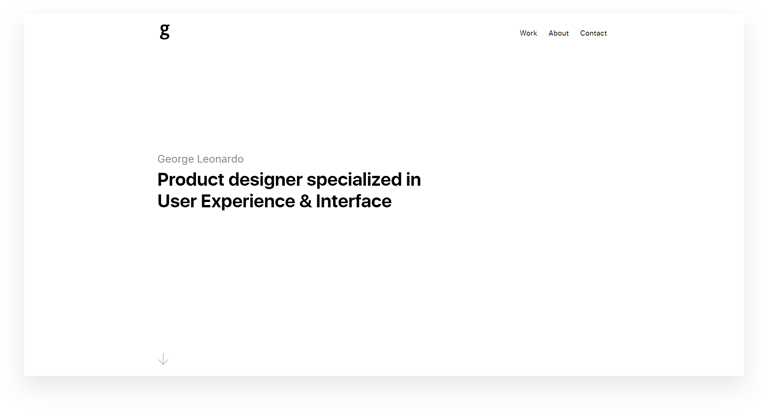
The whole idea of minimalistic design is to take the focus from… design and shift it towards the content itself. A neat, contrasting or even bold text overlapping a white background should easily grab the user’s attention from the start.
2. Simple and daring color palette
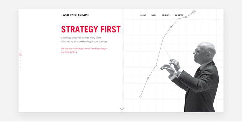
In most cases, the color theme juggles with a main color and a secondary color. The main color emphasizes the CTAs while the secondary color helps to break down the monotony of a page.
3. Efficiency from text to image
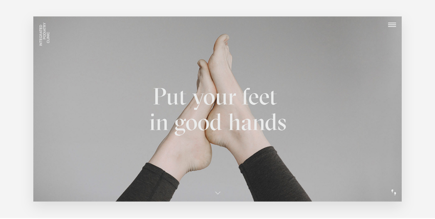
Minimalism is all about cutting down the unnecessary elements. From actual information to design details, it sets the tone to an effective yet eye-catching communication. Less is more, remember?
http://integratedpodiatry.com.au/
4. Focus on the details
Even though simplicity is the norm, never underestimate the power of details. Particularly because you have already stripped down all the unnecessary elements in the design, whatever left must be absolutely stunning in visual terms. Naturally, this would imply more than the simple drop shadows.
5. Iconography
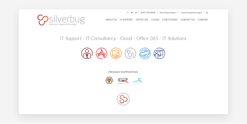
Minimal design uses icons in clever ways, by substituting links or CTAs wherever possible. Since iconography is the art of portraying subjects through images and symbols, its most common implementation is in the navigation of a website.
Final thoughts
Not so long ago, design used to be cluttered and overwhelmed with information. Users were having problems finding the information they needed on a website. But a lot has changed since minimalism kicked in, for a very simple reason:
Minimalism caters to a basic need: ease of access to information.
In a world where everyone and everything is on the rush, a website easy to navigate makes the difference between turning a visitor into a prospect or a lost customer. Whenever used correct and in a logical way, minimalistic design improves the user experience, making your users happy.
Want to know if your website could use some minimalist touches?
Let’s chat and we can show you in how many ways you could make your website simpler, cleaner and more accessible. Take a look at our Visual Identity services.
Better yet … Say Hi, don’t be shy >> Ask a quote


