
Call To Action – all you need to know on how to improve your CTA
You’ve probably heard many times about the button/message Call to Action (CTA), but you didn’t had the opportunity to understand what it is and how or where to use it.
Well, in this article I will try to explain you what’s a CTA, how to create or optimise it and where to use it.
What’s a call to action
What’s a call to action – definition CTA
According to Wikipedia, “a call to action (CTA) is a marketing term used extensively in advertising and selling. It refers to any device designed to prompt an immediate response or encourage an immediate sale. A CTA most often refers to the use of words or phrases that can be incorporated into sales scripts, advertising messages or web pages that encourage consumers to take prompt action”.
Call to action (CTA) is that text which is designed to attract attention and determine the readers perform the desired action: to read more, to download a document, to add items into the shopping cart, to register to an event, etc.
The CTA purpose and importance
The CTA purpose is to attract visitors to your business website. This is often a long process, involving qualified resources and a sustained effort. But, the hard parte is to convert a large number of visitors into leads… not so simple, isn’t it?
Let’s see….the statistics shows that only 20% of visitors are ready to interact with your products or services, and the remaining of 80% is still at the research stage. Most often, the decision to buy a particular product is not taken immediately. When somebody needs to buy a product, they start to find and define the need, then they move on to the search and inventory the solutions, they make a short list of products and then they choose.
But until the client will choose, you have a lot of work!
To achieve an efficient CTA, you must know that he has two major parts: the design and the text/keywords. Besides these, another important part, is that the CTA button must appear each time when you promote, create or launch a new product for your clients. It is the button which urges them to download, buy, or to learn more about what you have to offer.
The ideal CALL TO ACTION button, is not easy to find.
My advice: Don’t make the mistake to underestimate the value of a CTA!

How your CTA should look – the CTA design
As I said, one of the most important parts of a CTA is his design. Regarding the CTA design, you can use bright colors to attract attention, but not flashy. The colors should make contrast with the page in order to attract users’ attention and increase the chances that they perform the desired action, but without disturbing them visually.
Well, the CTA must be very very simple. He must be clear, concise, to not cause confusion or to be overloaded. Don’t confuse your visitors with too many offers, choices or actions. Cluttering your CTA button with too many icons, may decrease the trust level of your visitors and to make them confused with their decisions.
The most proper colors you can use to design your button are: red, orange, green, blue, black, gray, but always accompanied by a contrasting color text, which will stand out, clear, visible, fast and easy to read.
On each product you promote, the call-to-action button should bring you optimal conversion rates. For example, if you have to promote a product, you can attach the CTA button on its right side or in the center, but it needs to be very highlighted.
No matter how obvious would be those buttons in terms of graphics, they should always be accompanied by a motivational text, enough to convince the visitor to click on them. The CTA button shall not be loaded with other graphics. Let him “breathe”. Give him enough space to be easily spotted.
Don’t be too aggressive! For example, don’t use pop up windows which will prevent someone from viewing a page. The only thing you will get is that your visitors will leave the site.

The CTA design – how your CTA should look
Where is the right place to put your CTA
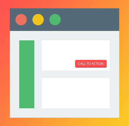
The place where your CTA should be inserted
To be successful, the CTA should be inserted in a visible place – in a paragraph or on a button. What is also important is that the CTA must be doubled by an offer at least as attractive as the message. With a ‘call to action’ in the right place and in the right context can significantly increase the conversion rate of the site.
Each page has a purpose, so each page should have assigned a call to action. On each page the ideal place for the CTA is definitely in the first screen of the site because readers have little patience with long texts and might never reach the bottom of the page.
Usually the ‘call to action’ positioned in the center of the page has more success than those placed on the edges, but the situation may vary from site to site.
My advice is to test what is best for you, but don’t exaggerate with the number of ‘call to action’ on one page. If you need some CTA examples, take a look on our web portfolio.
How you can optimise a CTA
If you have already a CTA button, and you need to optimise him, here you have a few methods:
- KISS Method
- KISS – keep it short and simple – which means that your CTA must be short and simple
- Begin with an imperative verb like: buy, see, get, etc and don’t use general or passive phrases.
- Say what lies at the other side of the link – what exactly they will find: an article, program, image, etc
- Use visible buttons and links
- Put a little pressure on the reader
- Use timestamps to suggest the importance of implementation of the action: today, now, etc.
- Use the numbers
- Where it makes sense, use the numbers to draw attention to some innovative features (power, speed), awards or reduced price
- SEO Optimisation
- Add “alt” text to all your links and buttons for additional SEO value

The CTA optimisation
Test, test and test again your CTA
For more efficiency, always test the CTA button. A highly conversion rate for a site may not work for another, so you need to find the right call-to-action, which will works for your business.
Using different texts can lead you to mixed results, that’s why I suggest you to test several texts and page positions for a certain period, then check the results.
For example “Download free report” may sound better than “Free Information”, or “Add to Cart” will not work as well with “Start now.” Try to change the colors or the shape of the CTA button depending on the items you have listed. Test it until you will find the right and the appropriate CTA for your website.
Sometimes you need more tests to finalize the best version.

A few CTA examples
Depending on the type of site, there are several alternatives for your CTA for blog, presentation website, e-commerce or newsletter:
Shop now
Shop our fall collection
Get 50% off. Shop now.
Shop best sellers
Save today
Buy now
Buy it today
Yes! I want one.
Find out how
Start today
See how your business benefits
Get results now
Start now. Get results.
I’m ready to see a change
Order now
Repeat your order
Claim your coupon
Reveal my mystery coupon
Start saving today
Complete our 5-minute survey
Take a survey
Leave a review
Follow us
Stay connected on social
Like us on Facebook
Get the app
Watch now
See the crazy video
Hear from our CEO
Hear her story
See the difference you make
Reserve your seat
Register now
Book your tickets
Give us your feedback
Let us know how we did
Don’t delay. Save now.
See your hand-selected deals
Get 50% off now
Shop for the clothes you want
Free gift with purchase
Buy Now
Find holiday gifts
Shop Santa’s favorites
Spread holiday cheer
Tis the Season. Donate now.
Claim your birthday coupon
Shop birthday deals
Yes! I want my birthday deal.
Our gift: 15% off
Learn more
Read more
Curious? Read on
Download the eBook
Download now
Keep reading
Read the full story
Count me in!
Book now for early bird prices
Sign me up
Save me a spot
Register for our webinar
Book your next appointment
Start your free trial
Upgrade now
Yes! I want a free upgrade.
Make me a VIP
Sign up and save

Optimise your call-to-action button and increase your conversion
Your business needs a credible amount of successful conversions to survive? Using the above tactics and optimizing your call-to-action button, your conversion rate will increase substantially.
If you have questions or you need help with your CTA,
do not hesitate to contact us!