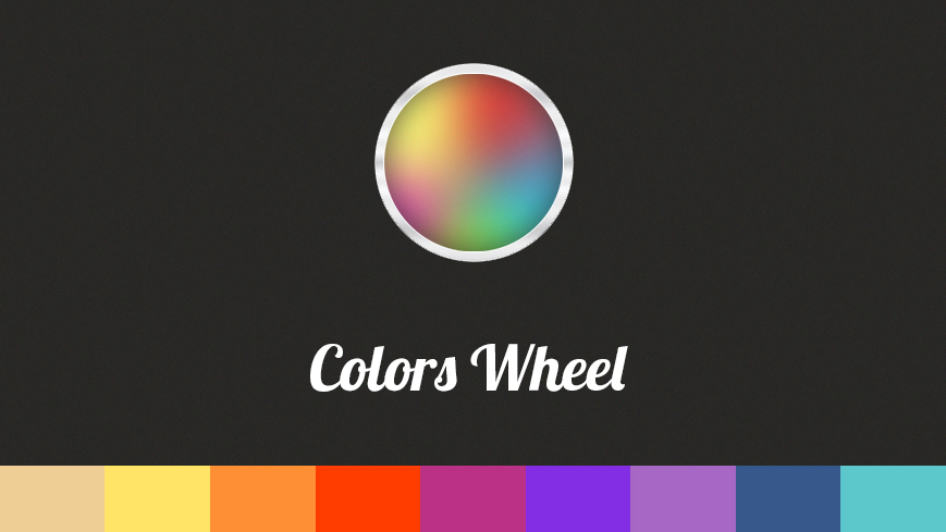
Importance of web design colors selection
Either we call them colors (color – in American English) or colours (colour in British English), it’s not a news anymore that colors play an important role in our lives and our users’ experiences.
In this article we will explain you the importance of the web design colors selection.
We’re not going to talk about the history of colors (even if it might be interesting for some) but about how colors apply in web design and how to use primary, secondary and tertiary colors. The most important thing is to know how to manipulate them (even if it might sound as a dark practice).
We think that colors are sides of subliminal marketing and knowing how colors work, may enhance your marketing efforts to better control the subconscious judgments your customers will make about you. Even colors are perceived differently across the different cultures on the globe, that’s why, we will describe you the ones that are the most relevant to Western cultures.
Apart the aesthetic role that appeals to the eye, colors have a deeper psychological meaning and the skill of using them is no less than an art form. In talking about colors, we inevitably should reffer to contrast, complementation, vibrancy, with the emotional implications of colors and what do they promote.
Red promotes: power, importance, youth
Orange promotes: friendliness, energy, uniqueness
Yellow promotes: happiness, enthusiasm, antiquity (darker shades)
Green promotes: growth, stability, financial themes, environmental themes
Blue promotes: calm, safety, openness (lighter shades), reliability (darker shades) – here’s another great article on the magic of blue
Purple promotes: luxury, romance (lighter shades), mystery (darker shades)
Black promotes: power, edginess, sophistication
White (yes, here is white) promotes: cleanliness, virtue, simplicity
Gray promotes: neutrality, formality, melancholy
Beige promotes: traits of surrounding colors
Ivory promotes: comfort, elegance, simplicity – check out some examples of how to use pastel colors in web design projects (Source)
Colors influence the psychology of decisions and behavior, and there are also differences in how colors communicate differently to genders.
A color theory edition would clarify all important aspects that every web designer should know: how colors work together, color profiles explained (Pantone, RGB and CMYK), how each color evokes various feelings, how warm and cold colors should combine, which tones are available to use, harmonious color schemes and so on.
Here’s a cheatsheet of best 50 infographics on colors for webdesigners
If you are curious to know when did the first book of colors appear, well…it seems that 271 years before Pantone came out.
The book was said to be used as an educational guide of water color painting according to Medieval book historian Erik Kwakkel. Interestingly enough, the contemporary version known as the Pantone Color Guide, only got published for the first time in 1963 (Source)
How important are colors in web design? Read on our blog https://www.design19.org/blog/colors-in-web-design/
Posted by Design19 on 21 Aprilie 2015
Web design colors selection – the theory
We talked about the color theory but we should also take into consideration the “technical side” of colors for web, the saturation and how we can start with the CSS colour function hsl() that breaks down color down into hue, saturation and lightness.
Hue is expressed in a unit-less degree (out of 360) while saturation and lightness are expressed as unit-less percentages (out of 100).
So hue is expressed as a value out of 360. This value is mapped to a colour wheel. As you are spinning through hue values, imagine spinning around a colour wheel. If you have red (0) and you want to make yellow, you would just move hue to 60. (Source)
Don’t forget that before choosing different colors for parts of your website (the prices colors, tags, call-to-action buttons etc) or for your website as a whole, you should always test what works best for you according to your brand personality and not follow blindly any “best-practices” guides.
What’s Your Goal?
The first thing you need to figure out before determining the right color palette for your audience is what your goal is. The argument for this is pretty powerful. One study found that it takes just 90 seconds for people to form an opinion on a product and 90% of that opinion can be determined by the colors used in the product. (Source)
As a conclusion, with this article we’ve only scratched the surface. Hopefully, we’ve offered you the information that will make you look for more on this topic and that will help you in deciding (by yourself or together with your web design team) which colors to use in web design to convey subliminally right messages in order to reach your audience.
If you need more information on the web design color selection. don’t hesitate and contact us!


